非死不可
On 7 July 2009,
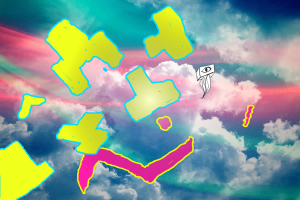
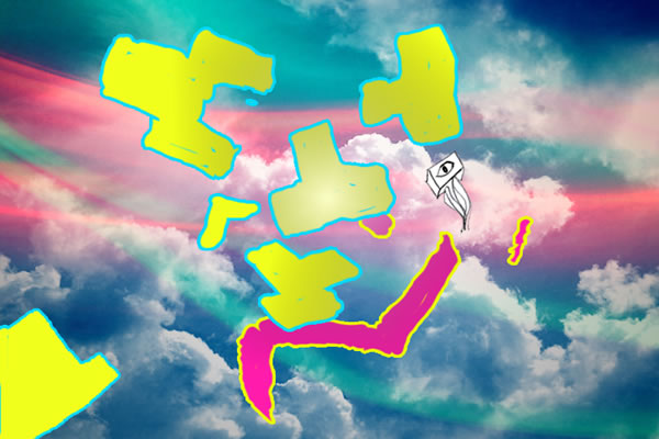
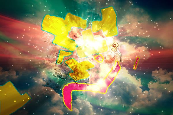
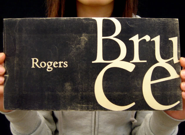
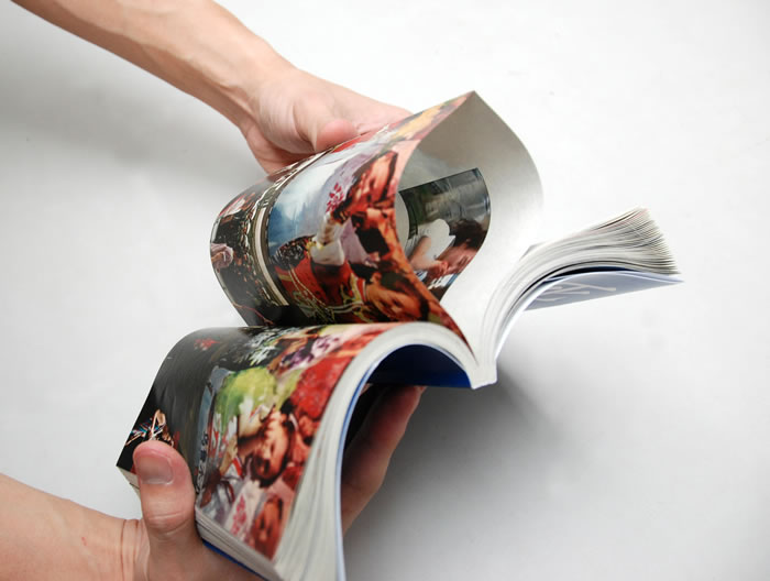
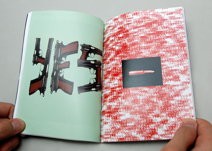
Facebook was blocked in China. There was an uproar all over the internet as to why it happened. People in China were just plain upset over the whole issue, some of them felt like a part of their lives had been cut off. I sought to document this phenomenon, to record this collective reaction coming from blogs, forums and news sites. But in the process of documentation, the searching led me to the heart of the matter, which is the riots in western China, and suddenly the matter didnt seem so distant anymore. I realised what was happening in Urumuqi was directly affecting my freedom here in Shanghai. I started putting the two issues together, juxtaposing the different images and articles to make the connection. Suddenly the complaints and cries of the blockage of Facebook seemed so insignificant compared to the problems in Western China.
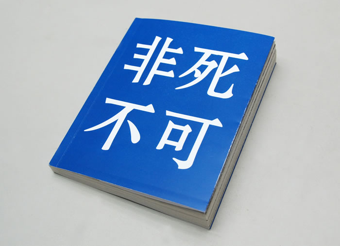
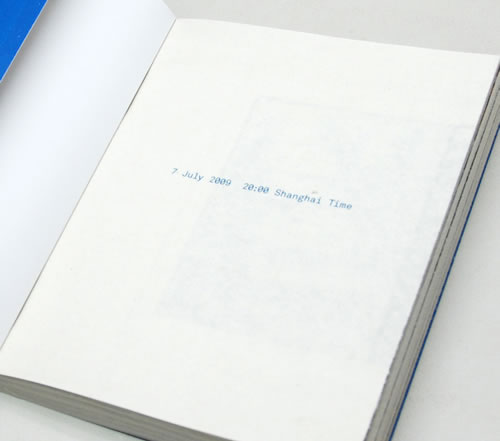
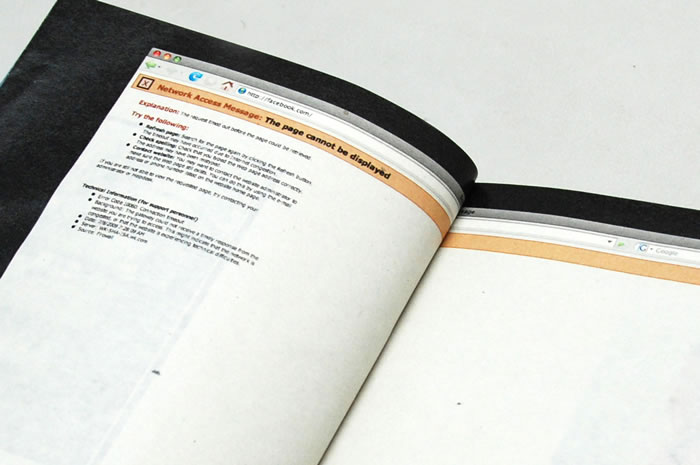
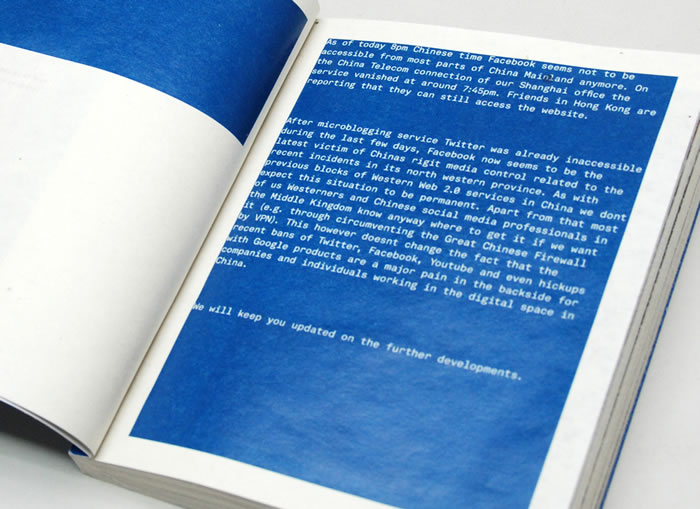
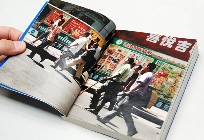
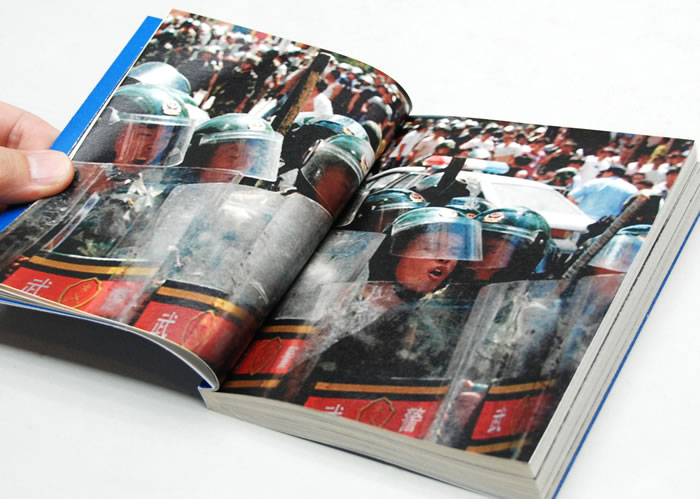
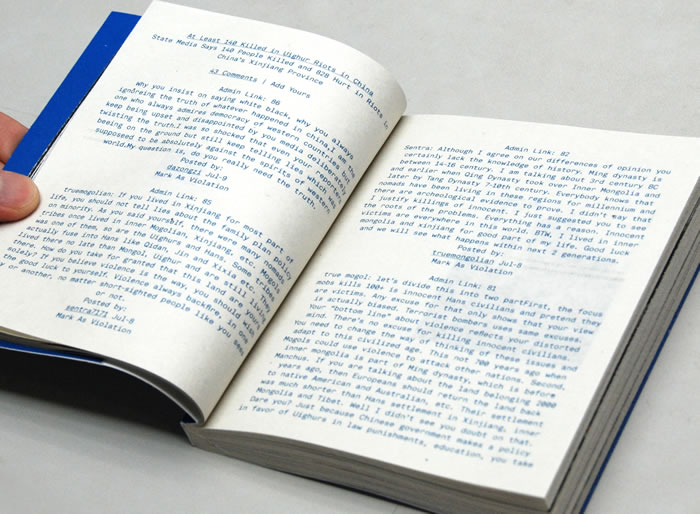
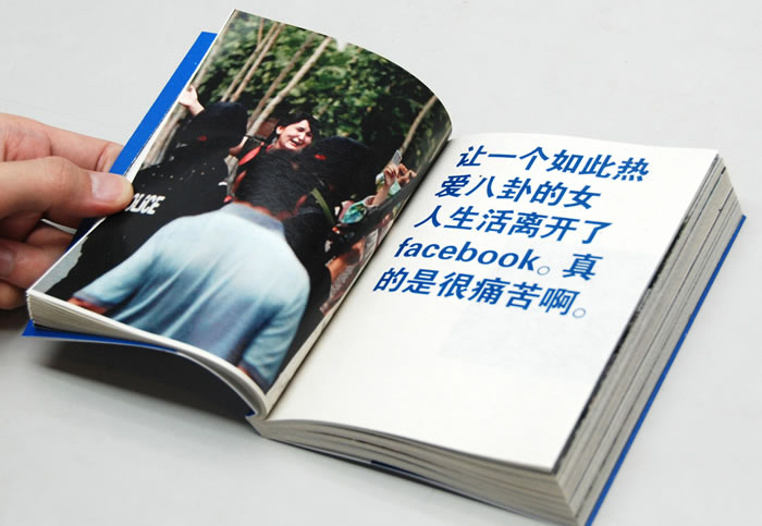
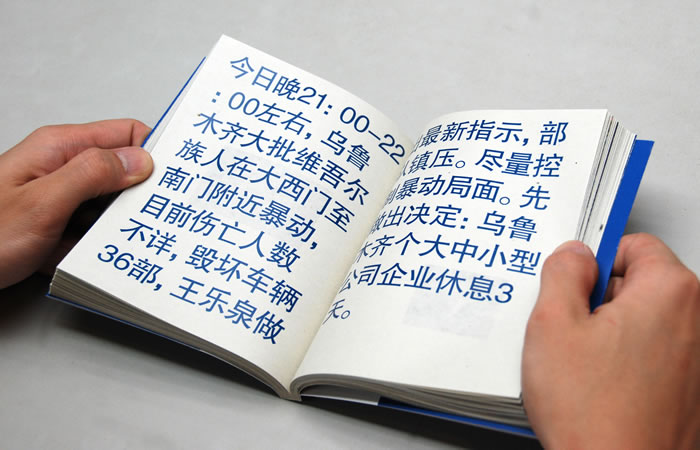
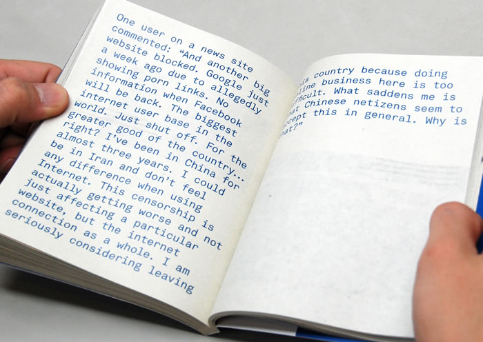
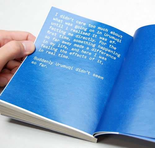
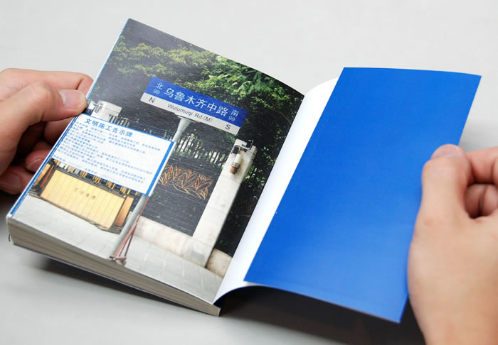
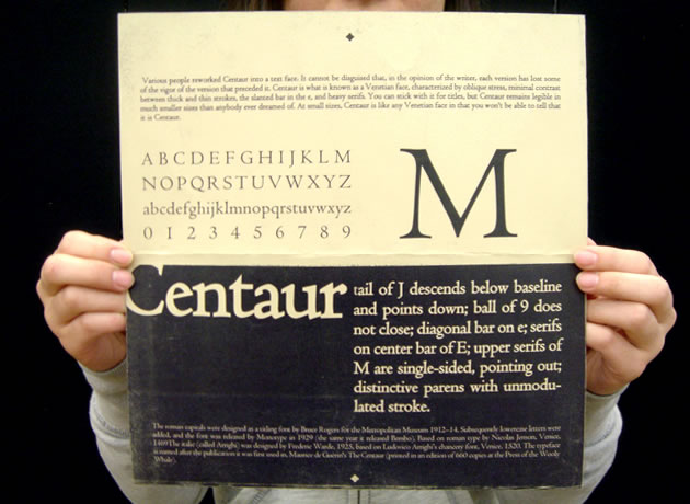
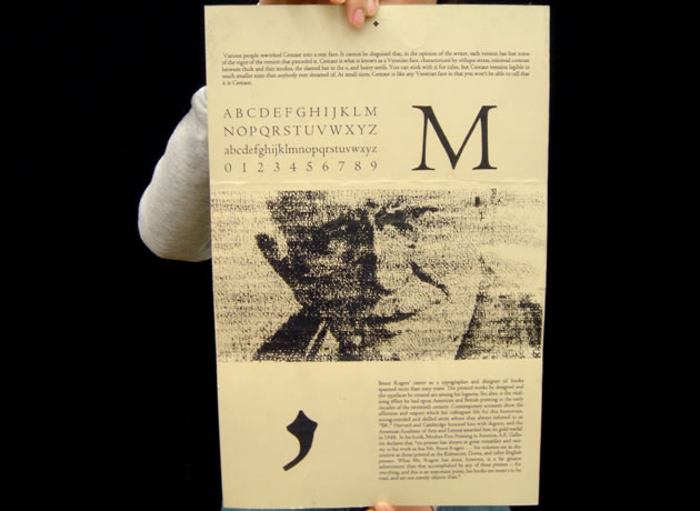
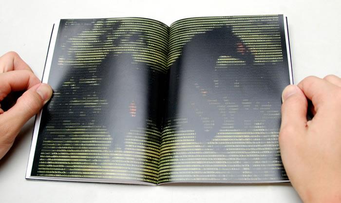
A day before I was about to print the book, a friend emailed me some gruesome pictures that had been circulating on forums. Some of them were pretty violent, but they nevertheless showed true footage from the incident, as they were taken by people on their cellphone cameras who were there at the scene. I decided to plant the images between every page (the pages were french-fold), expressing the censorship of the violence beneath all the content that is presented to us on most news sites. Some of my friends complained that it was hard to look between the folds, and I told them that was precisely the point I was trying to make; and if they wanted to go beyond the surface, they would have to rip the pages to reveal the hidden content.
Shanxi Kids
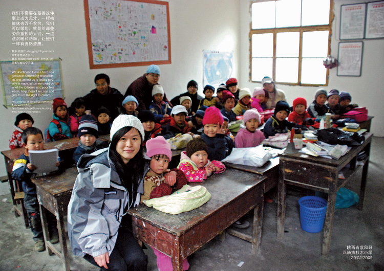
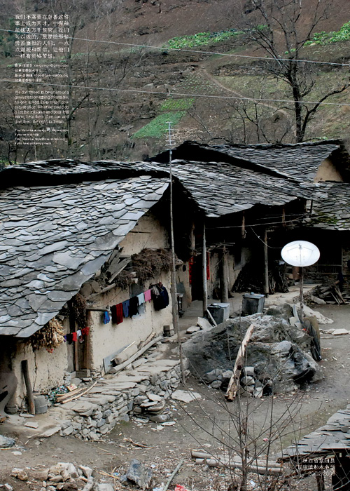
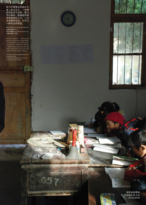
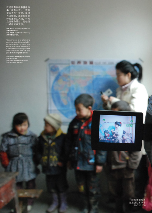
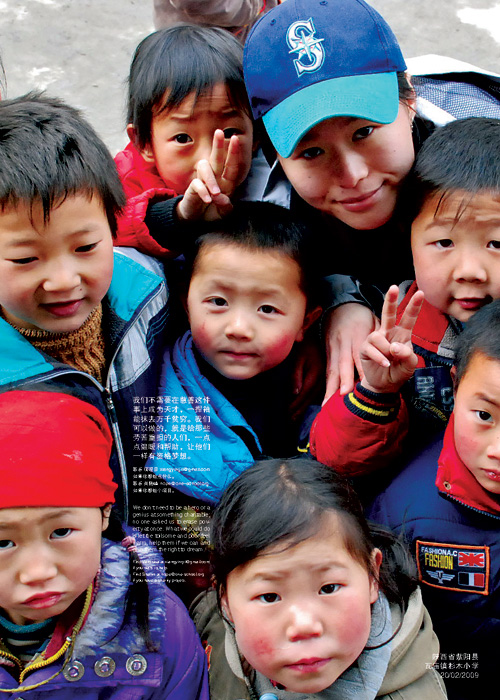
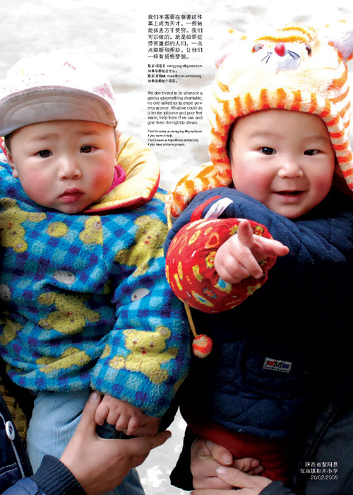
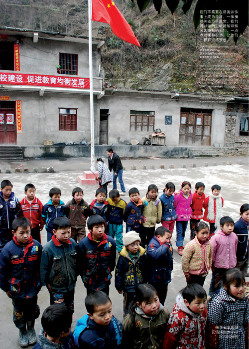
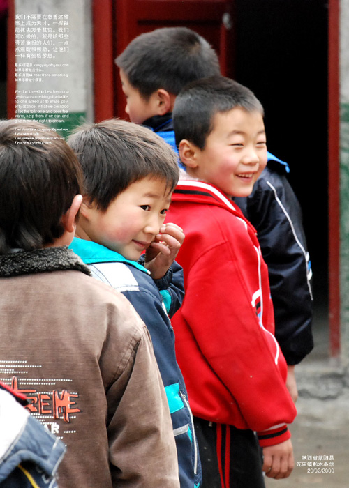
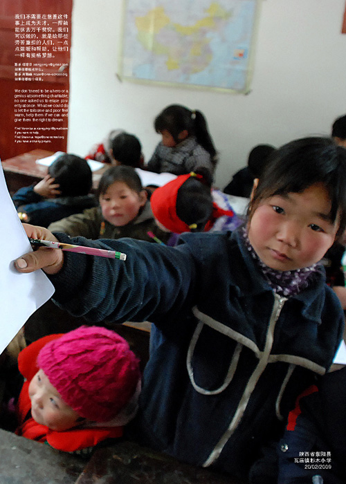
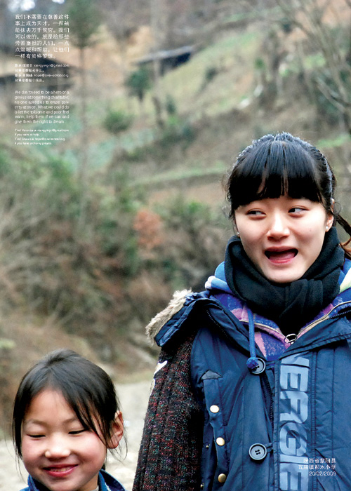
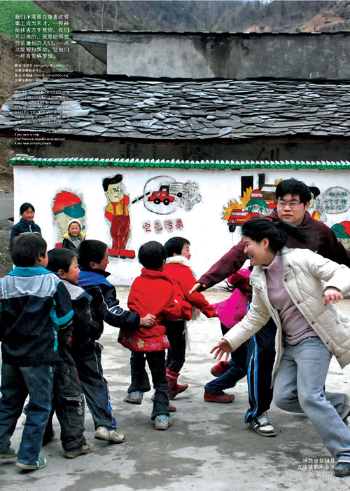
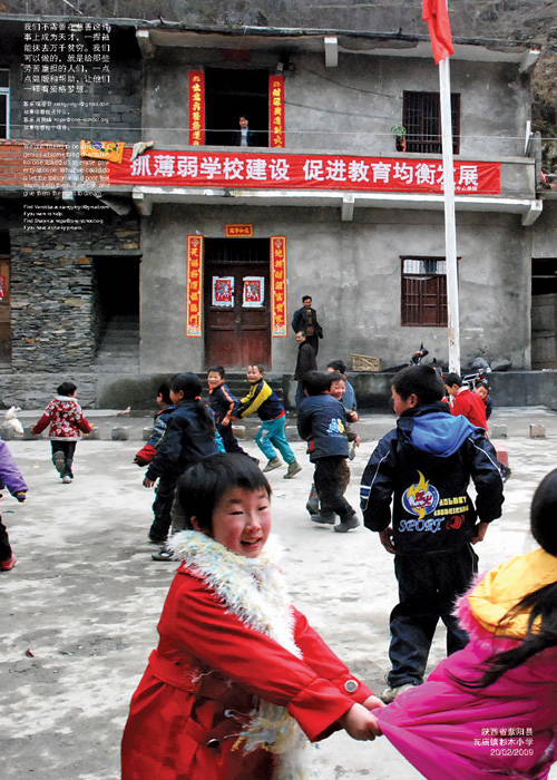
A friend of mine organised a trip to a rural village in Shanxi, China to help poorer kids. The group brought donations and spent time teaching and playing with the kids. To help spread awareness about this place, she approached me to help her design a series of posters which she could then give out to organisations to garner more help for these kids.
This is probably one of the more meaningful projects I have done so far, because for once, the work is being used to do good. Thank you Veronica, for letting me be a part of this.
Nike MVP
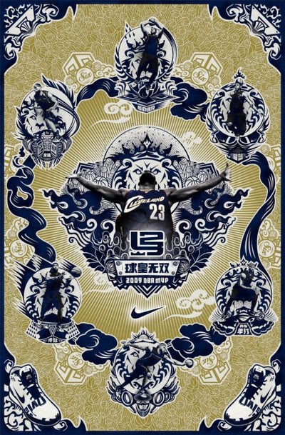
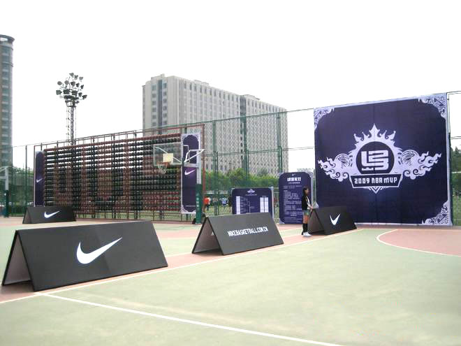
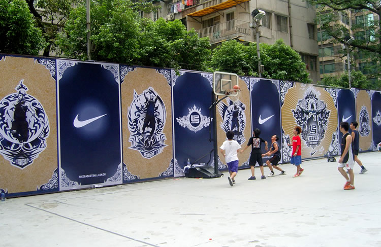
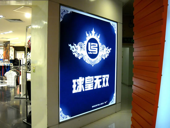
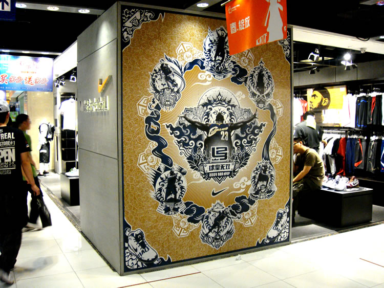
A campaign launched to celebrate LeBron James' MVP moment in the 2008-2009 NBA Season. The visual stems from the idea of a Buddhist Mandala, where LeBron is in the middle of a concentric circle, surrounded by his different manifestations, giving guidance to young basketballers who seek enlightenment from the MVP. The abstract forms surrounding each manifestation is derived by deconstructing the elements of his new shoe, as shown at the bottom of the poster.
Art Direction: Justin Hays/Nelson Ng
Illustration: Elephant Xiang
Copywriting: Zebra Hua
Studio Designers: Keith Wang, Kevin Cao
Project was done during freelance period at WK Shanghai.
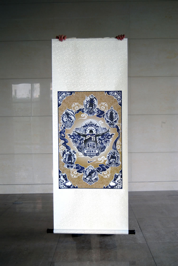
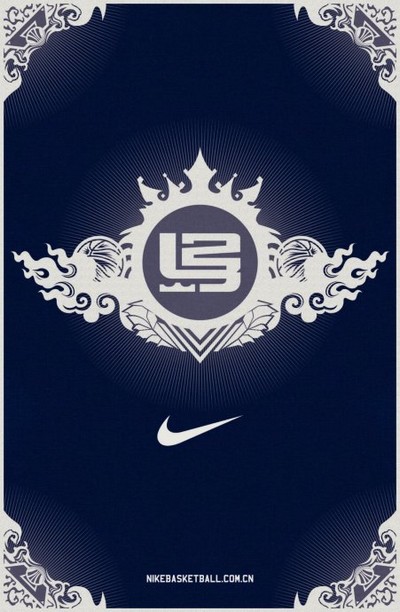
poster: front+back
outdoor basketball court installations(Shanghai, Beijing, Guangzhou):
Nike retail:
slideshow projection (Shanghai):
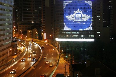
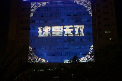
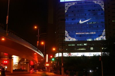
documentation of projection:
documentation of LED display(Shanghai People's Square):
Sprite pitch
Some visuals for a global Sprite pitch while at WK Shanghai.
![]()
![]()
![]()
![]()
![]()
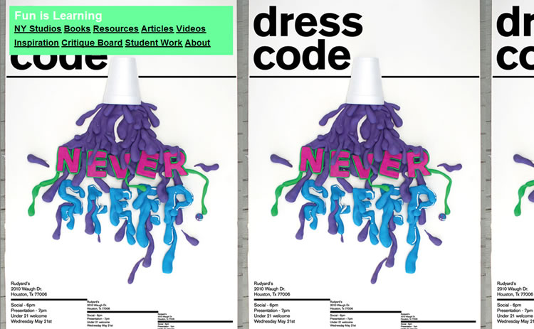
Fun is Learning
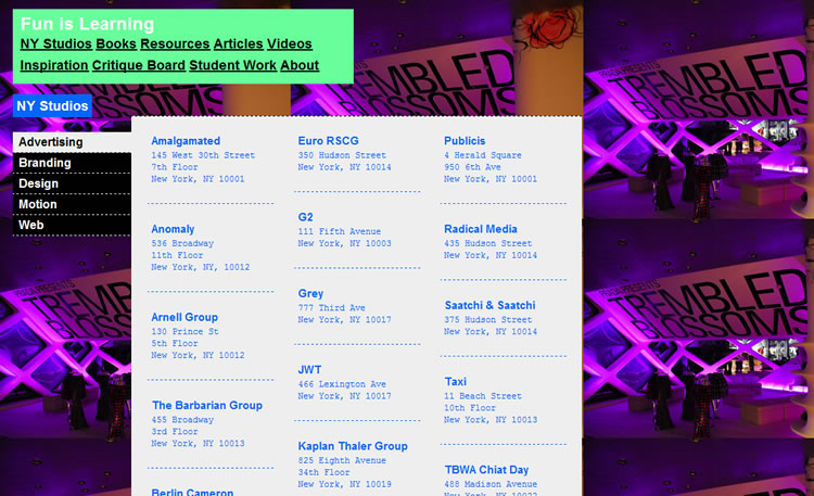
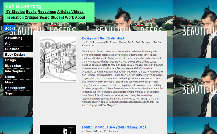
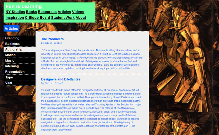
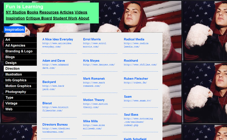
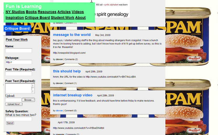
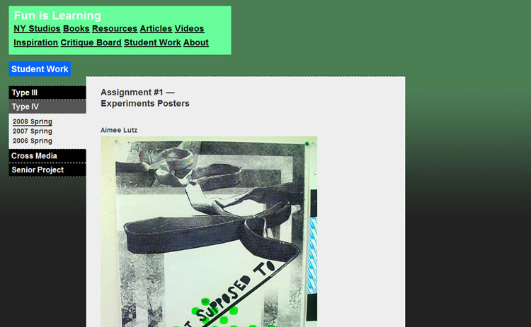
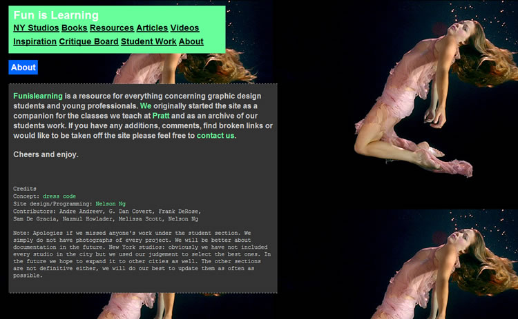
A resource for everything concerning graphic design students and young professionals done in collaboration with dress code. The background is generated randomly from the links that pertain to each page, reflecting the diverse scope of work and culture in the design world. launch site.
?+?
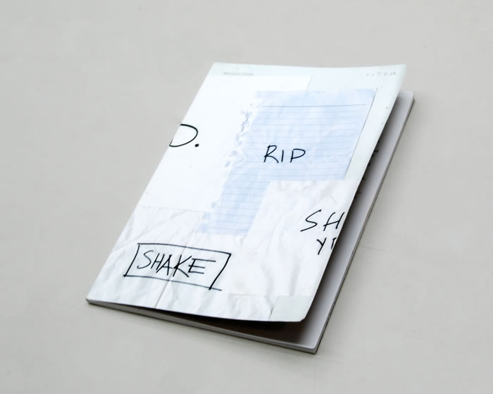
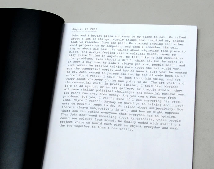
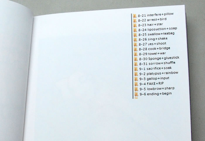
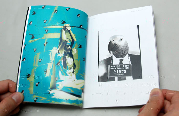
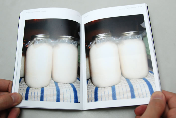
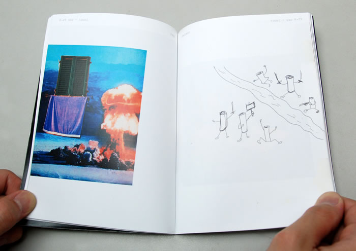
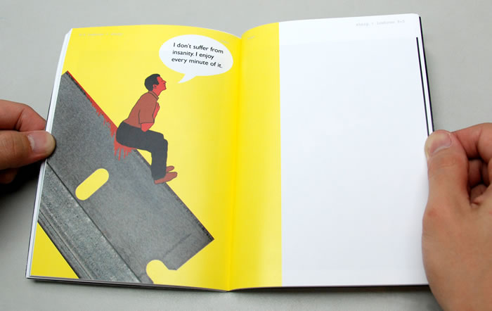
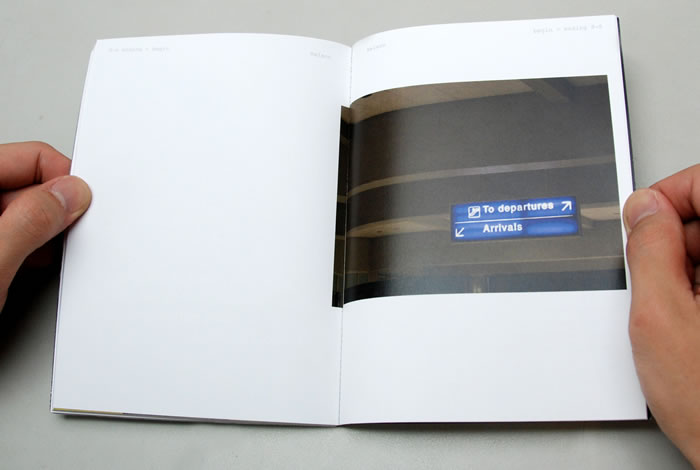
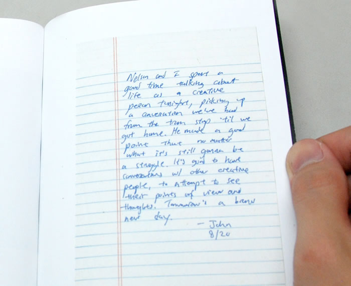
During our stay at Portland, a friend of mine, John Zhao, and I decided that we wanted to do a project outside advertising. So we created an outlet for our creative juices and decided to play this game of random mixing. Everyday we would surprise each other with a word, and we would have to create content based on the combination of the two words that we each come up with. We would write the words on post-its, papel towels, recycled paper, whatever we could grab, and it was always a pleasant surprise. We did this for 17 days and documented the whole process in a book, including our conversations that sparked the project and photographs of the paper that we wrote our words on.


Spelling Change
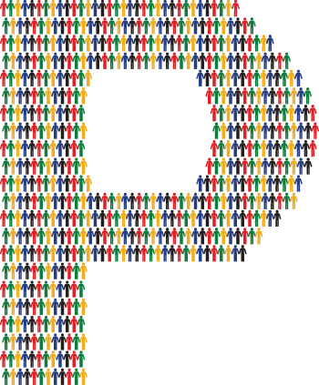
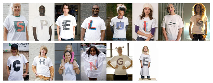
Contribution to a political project by Mother New York. Spelling Change was developed by a group of creative professionals to spread awareness and passion about the Obama campaign. Artists and designers were asked to create a letter of the alphabet inspired by the Obama campaign. View Submission.
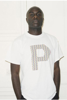 |
P, for me, stands for People. A nation is nothing without its people. What Obama stands for is not an ideology, but a common unity among people of different races and ages. If he wins, we win. Obama is a symbol. A symbol for the people. |
The Hungry Panda
Final project for a music class composed with three instruments: trumpet, violin and cello.
The piece was performed in Pratt Institute on the last day of class by musicians.
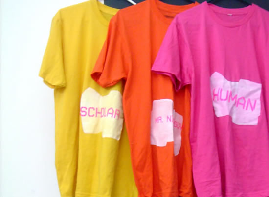
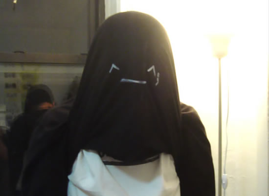
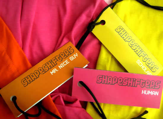
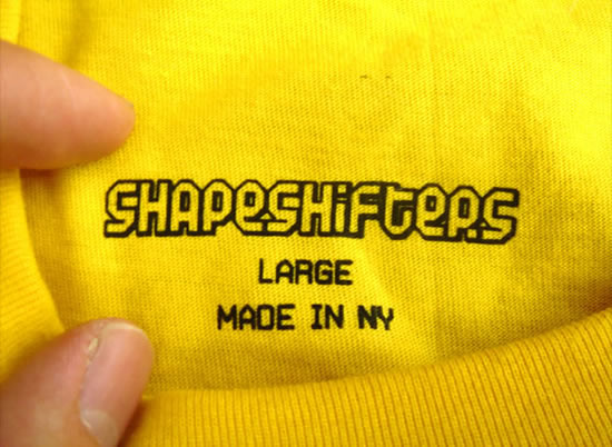
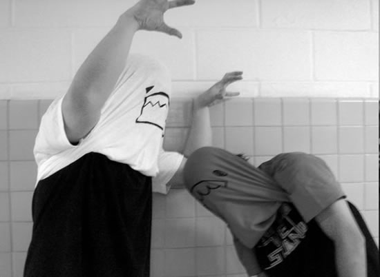
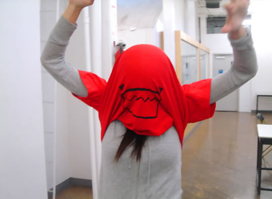
I Am My Shirt
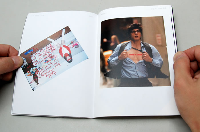
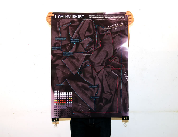
The shirt is one of 43 black shirts that i own, and it functions as a metaphor for who i am: conceptualized and branded in the west, but ultimately made and conceived in the east. It is also ironical how something made in China should be labelled in English, not unlike how I go by my English name in place of my chinese one. My shirt and I share a common lineage from a not-so-distant history.
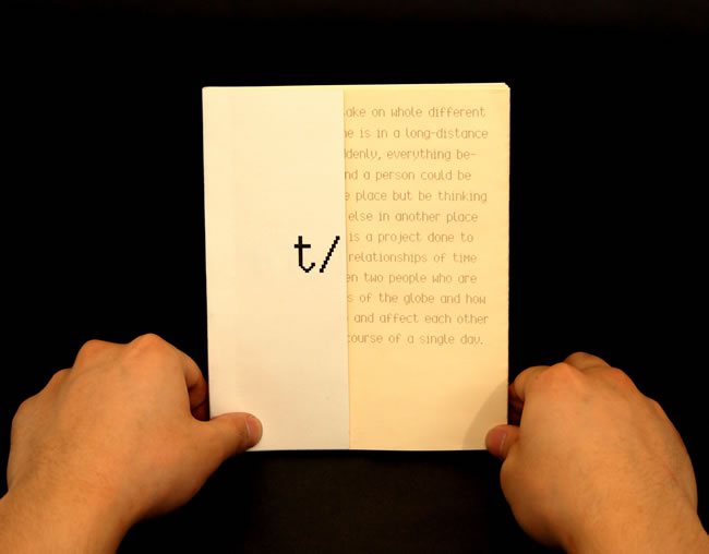
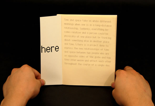
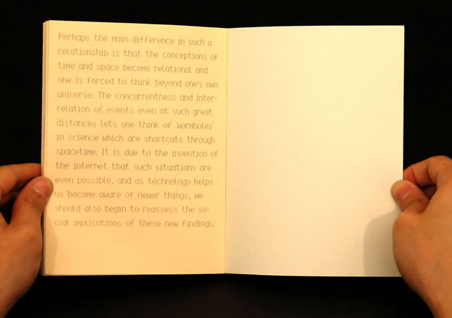
t/here
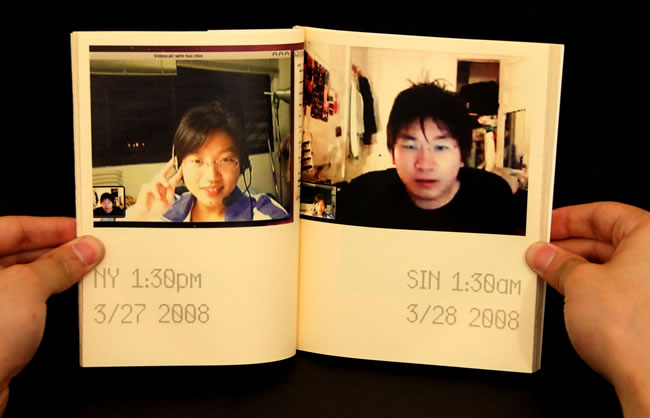
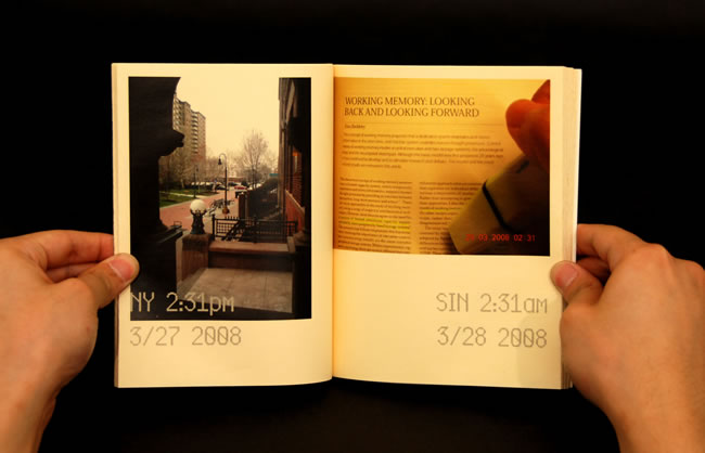
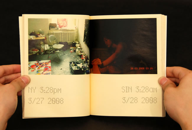
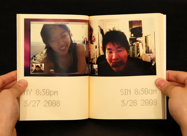
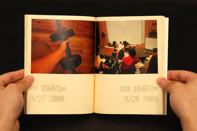
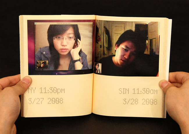
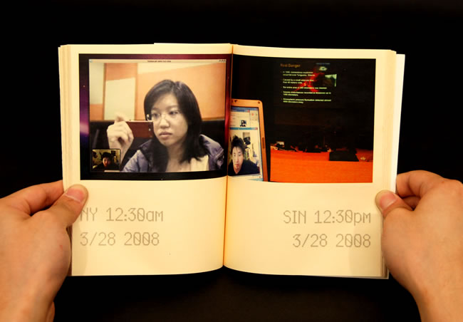
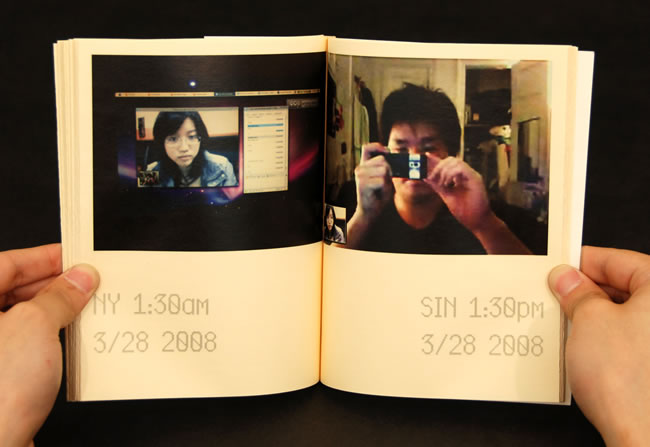
Time and space take on whole different meanings when one is in a long-distance relationship.
Suddenly, everything becomes relative and a person could be physically at one place but be thinking
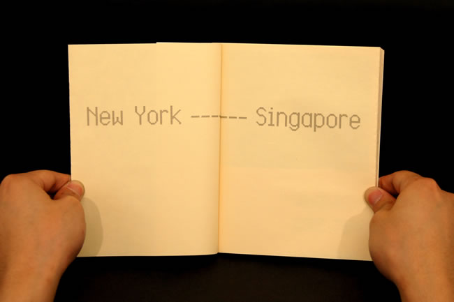
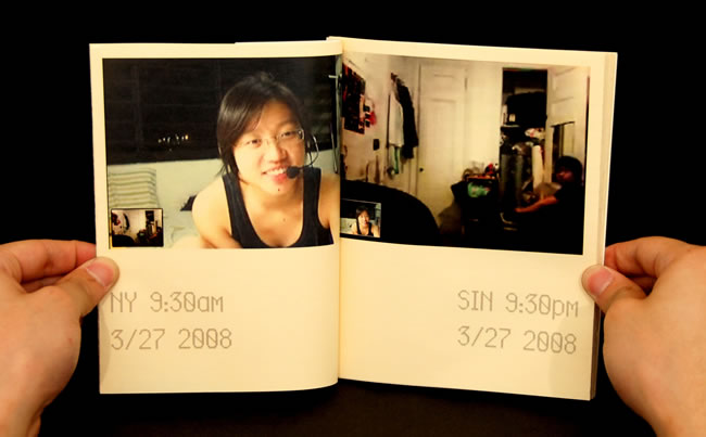
about something else in another place and time. t/here is a project done to express the new relationships of time and space between two people who are on opposite sides of the globe and how they inter-weave and affect each other throughout the course of a single day. Two simultaneous photos were taken at the same instance every hour, one in Singapore and one in New York, and compared to see how one affects the other.
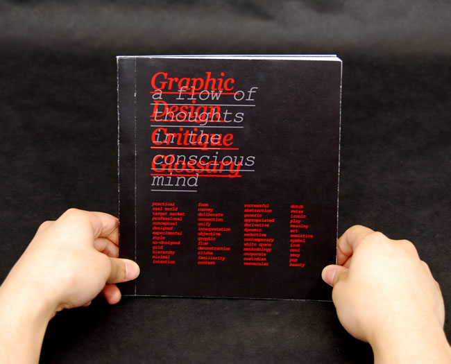
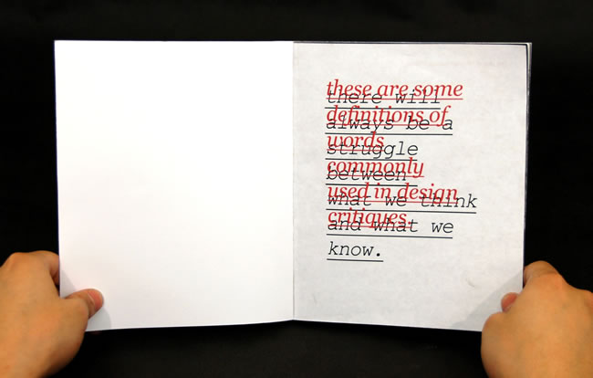
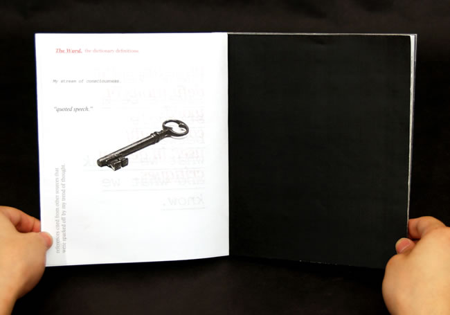
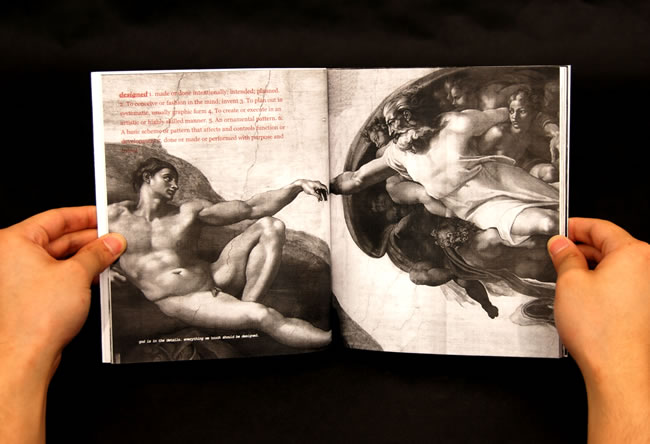
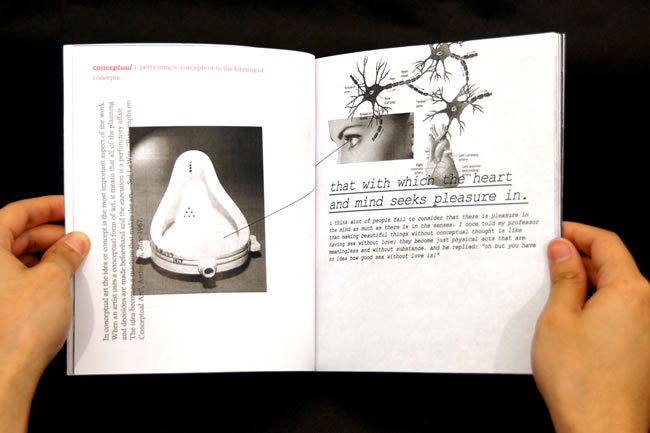
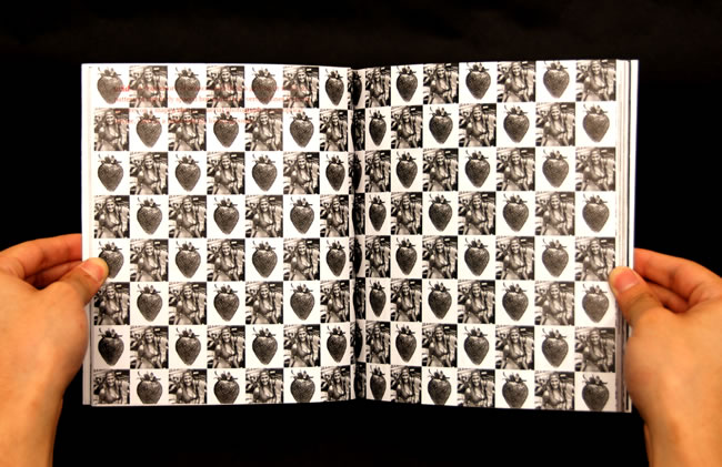
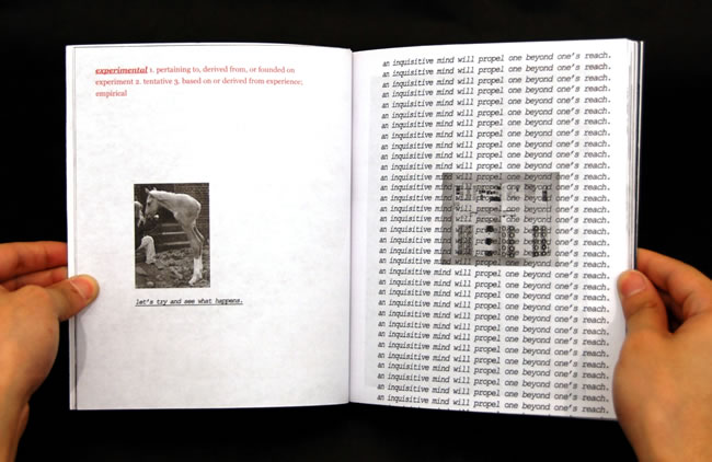
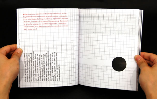
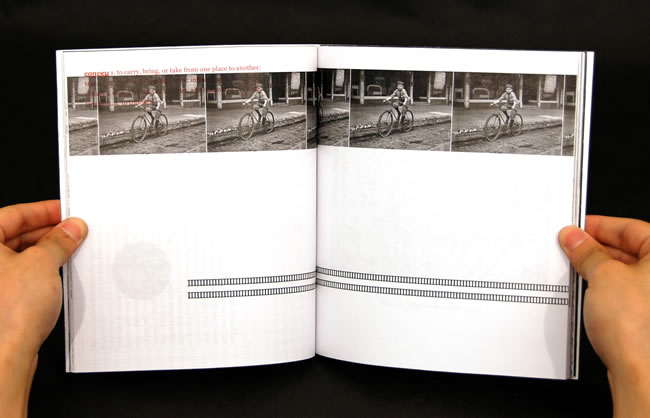
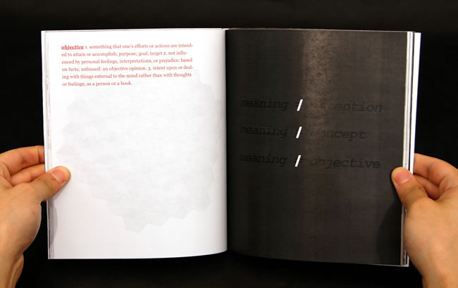
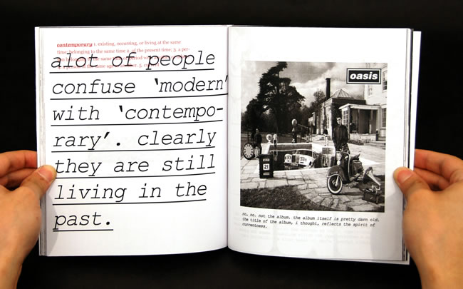
Graphic Design Critique Glossary
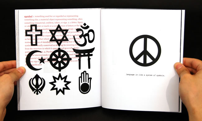
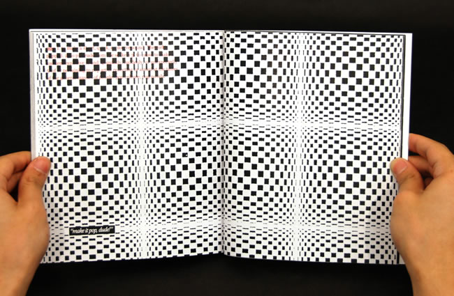
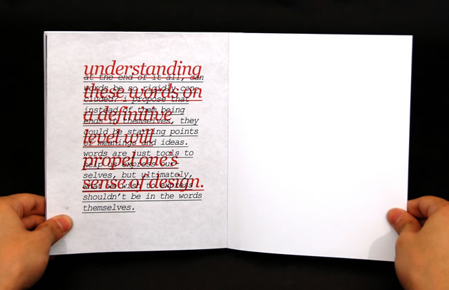
An inquiry was made into words that we commonly use in design critiques. What do words like
'cliche' and 'designed' mean? A struggle occurs between what one actually thinks the word mean and
what the dictionary actually defines them as. The conflict between these two points of view are
expressed in the book using two different colours: the red representing the dictionary definitions
and the black representing a stream of consciousness, juxtaposed and confronted against each other
to form new meanings. Ultimately, neither definitions nor thoughts are absolute; one can only use
these words as starting points, because what we wish to express shouldn't be limited to just the
words themselves.
Electro/Acoustic
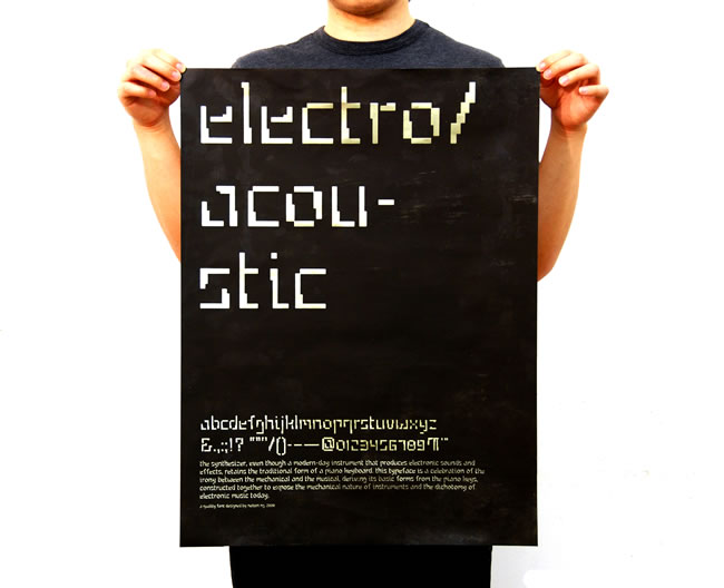
The synthesizer, even though a modern-day instrument that produces electronic sounds and effects,
retains the traditional form of a piano keyboard. This typeface is a celebration of the irony between
the mechanical and the musical, deriving its basic forms from the piano keys, constructed together to expose the mechanical nature of instruments and the dichotomy of electronic music today.
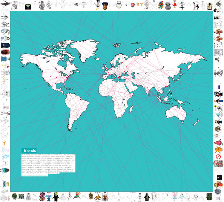
_friends map
A poster to map out the locations of the contributors in _friends 6 months since the project started.
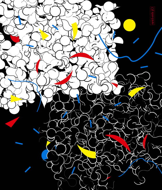
Metamorphosis
Final project for an electro-acoustic music class. This was an attempt to construct a piece that had
a song structure of ABCD, where the different parts would change in a progressive manner. Original sounds constructed using the Nord Modular, sequenced in Cubase, and vocal sounds (a.k.a beatbox) as percussion.
Enjoy.
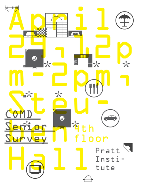
Senior Survey Poster
Poster for Communications Design Senior Survey 2008 at Pratt Institute.
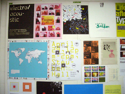
documentation of work presented at Pratt Senior Survey 2008.
Photograph stolen from Professor Madad's facebook.
Concrete Musings
What if buildings could talk?
This project expresses what it would be like if the buildings in
Pratt Institute articulated their thoughts by materializing their voices in the form of speech-
bubble stickers.(click on blue markers)
View Larger Map
Mic Test
An experimental piece involving only voices done to test the sound quality of a microphone made in China.
Percussion Project
A project which involved capturing analog sounds from various objects, sliced up and
put together on Cubase to form a percussion piece. Objects include a biscuit box with
wrapper, a plastic cup and a bunch of coins.
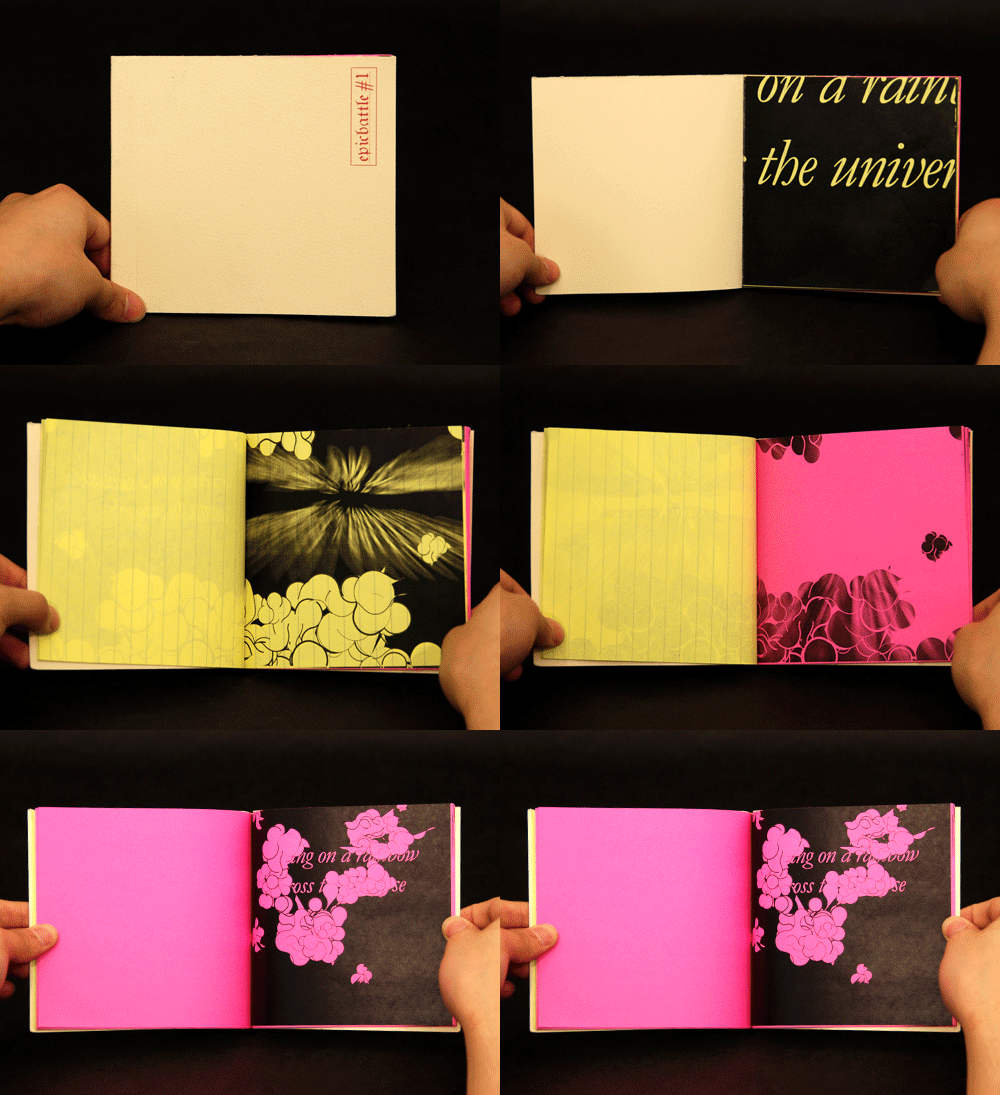
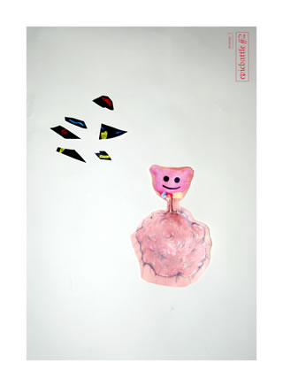
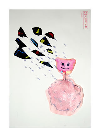
Epic Battles
A series of beautiful and ugly objects were made, thereafter put into battle against
one another resulting in different situations of defeat, victory and co-existence.
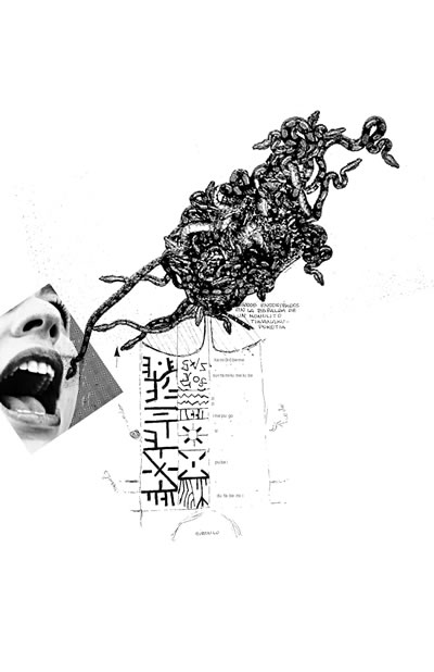
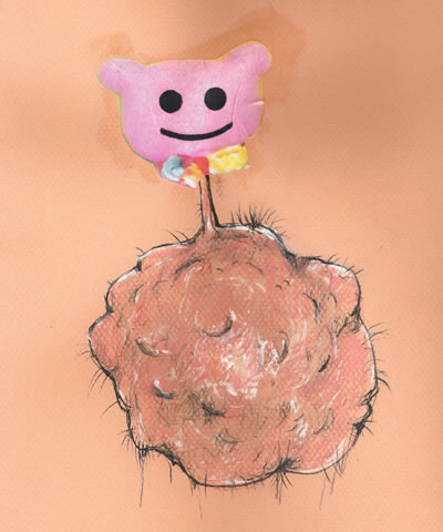
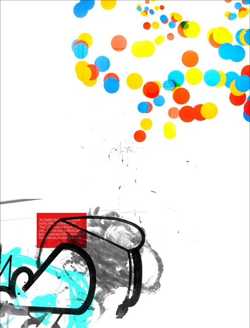
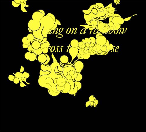
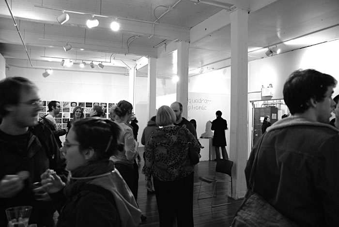
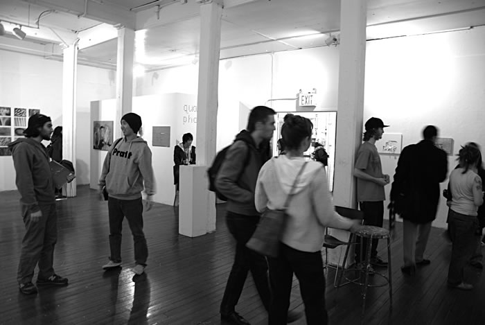
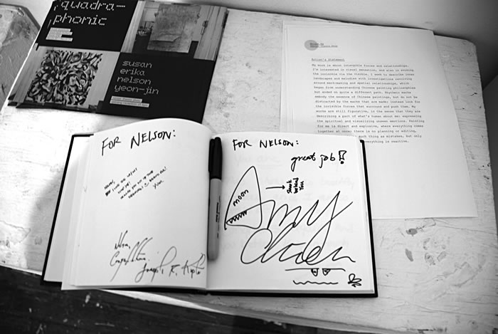
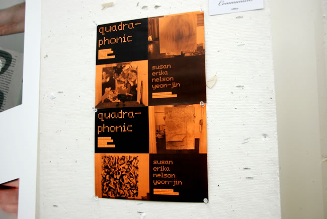
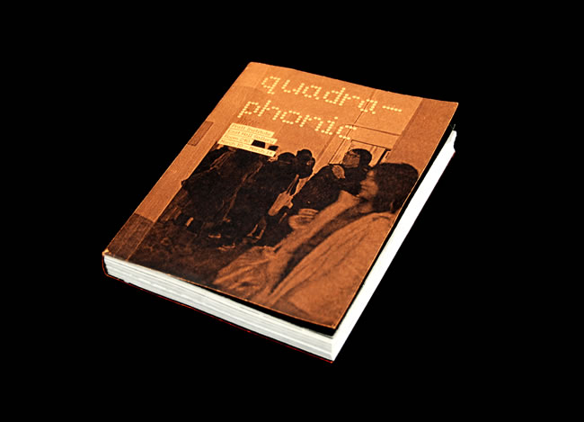
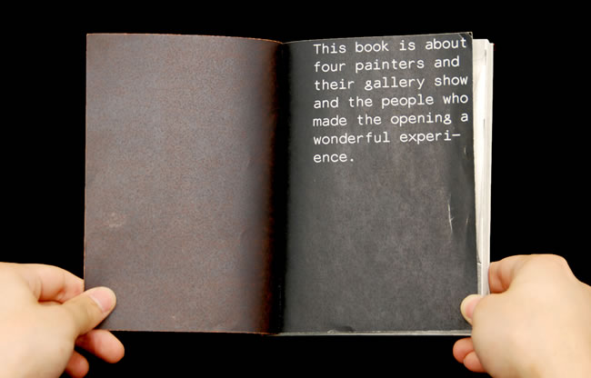
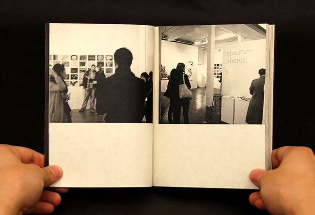
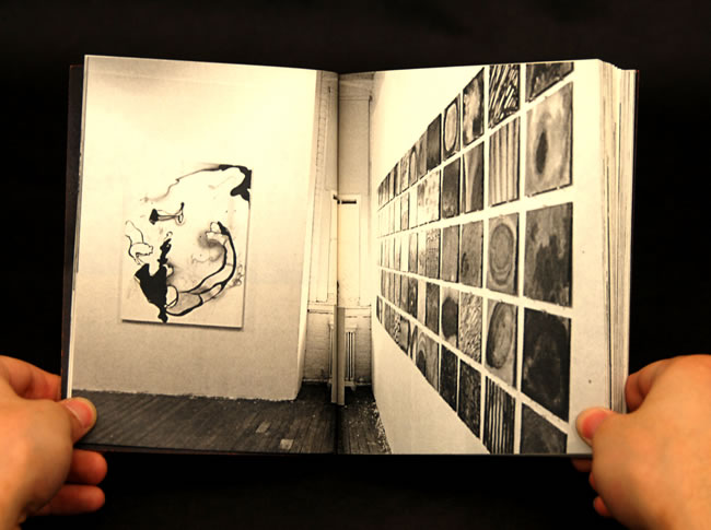
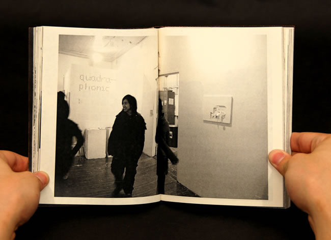
quadraphonic
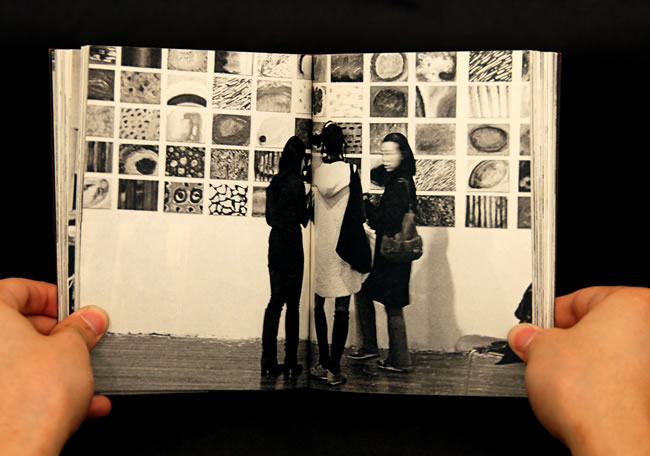
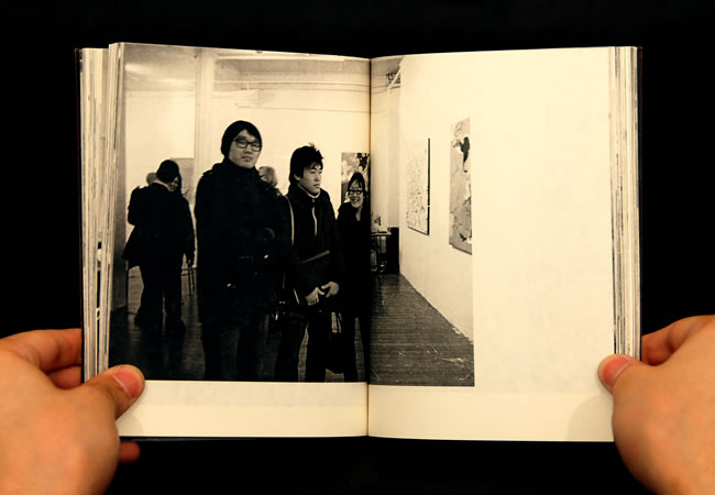
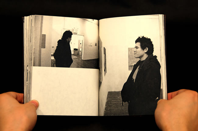
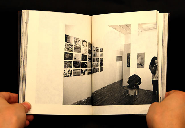
A senior thesis group show comprising of four painting majors in the East Hall Gallery
of Pratt Institute.
Each artist independently displays his/her own voice in the
work, but yet function together as a collective to form a quadraphonic visual sound.
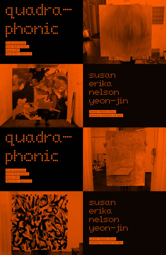
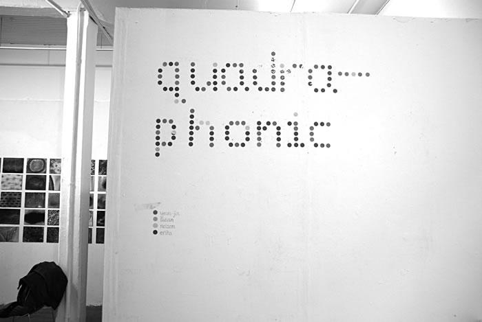
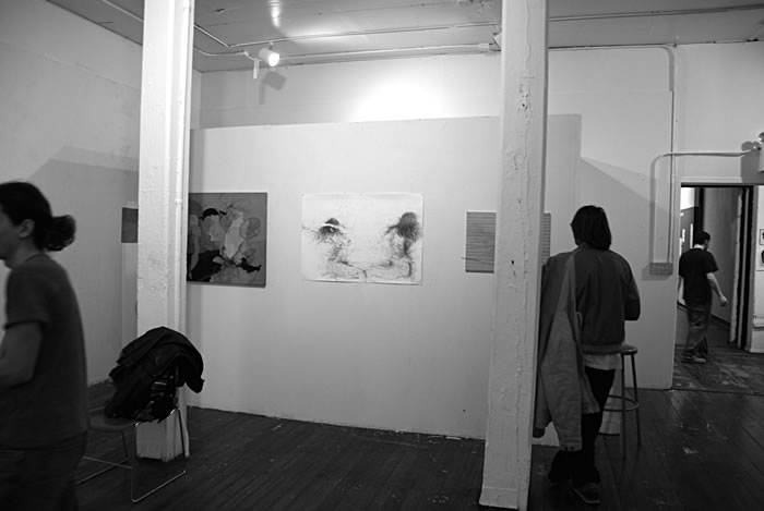
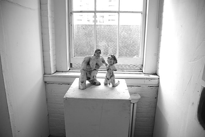
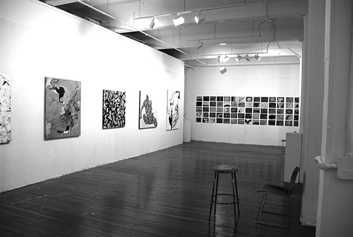
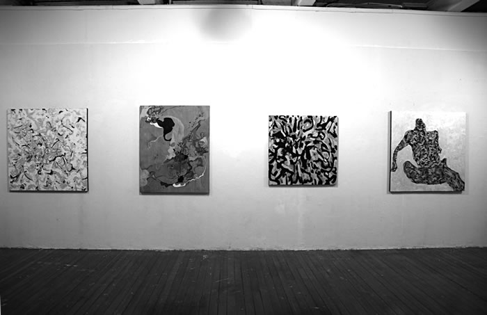
poster in action.
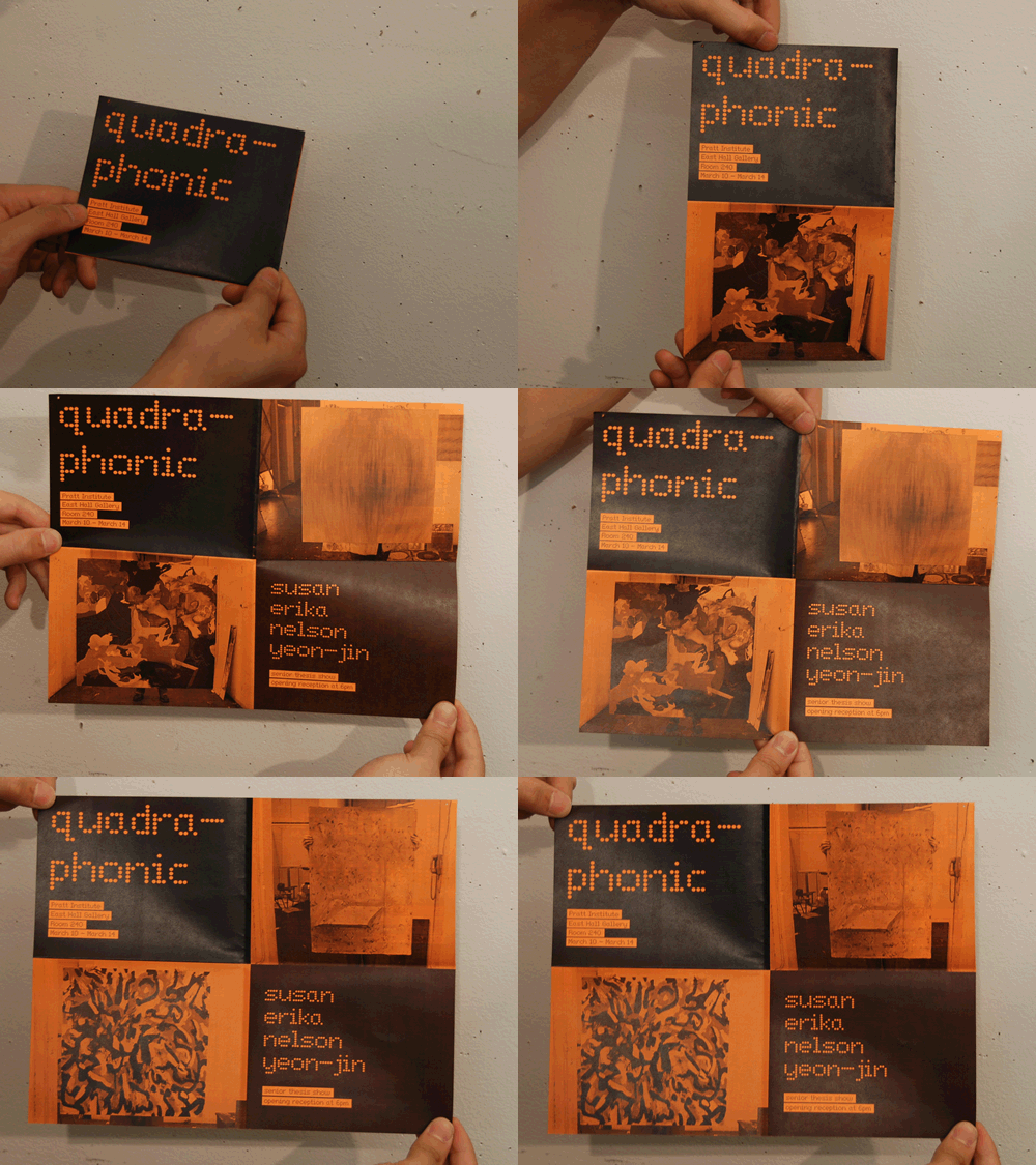
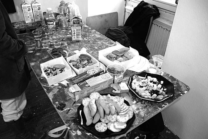
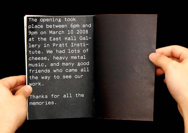
documentation of gallery opening.

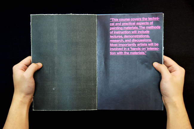
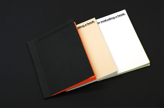
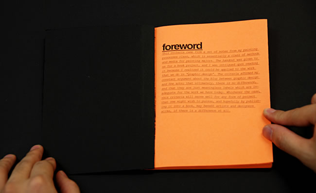
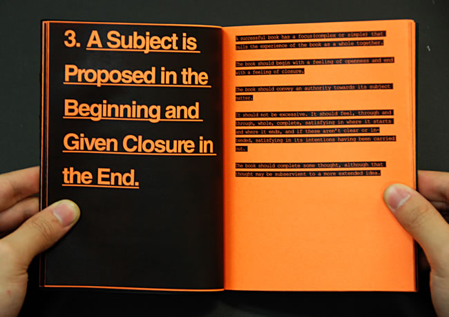
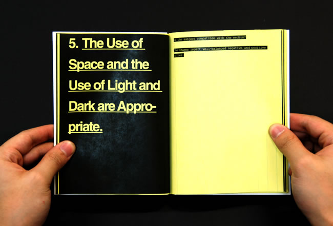
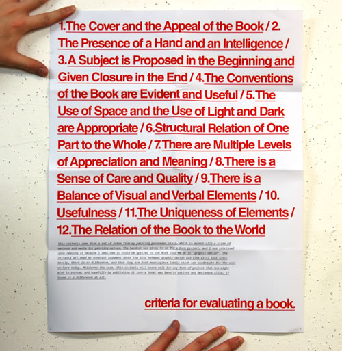
Criteria for Evaluating a Book
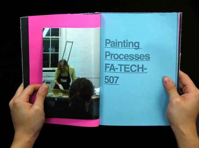
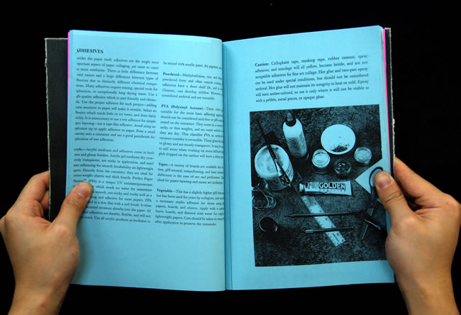
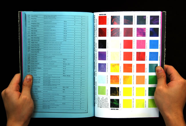
This criteria came from a set of notes from my painting processes class, which is essentially
a class of methods and media for painting majors. The handout was given to us for a book project,
and I was intrigued upon reading it because I realized it could be applied to the work that we do
in “graphic design”. The criteria affirmed my constant argument about the blur between graphic design
and fine arts; that ultimately, there is no difference, and that they are just meaningless labels
which are inadequate for the work we have today. Whichever the case, this criteria will serve well
for any form of project that one might wish to pursue, and hopefully by publishing it into a book,
may benefit artists and designers alike, if there is a difference at all.
download criteria.doc here.
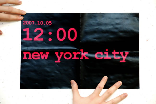
12:00
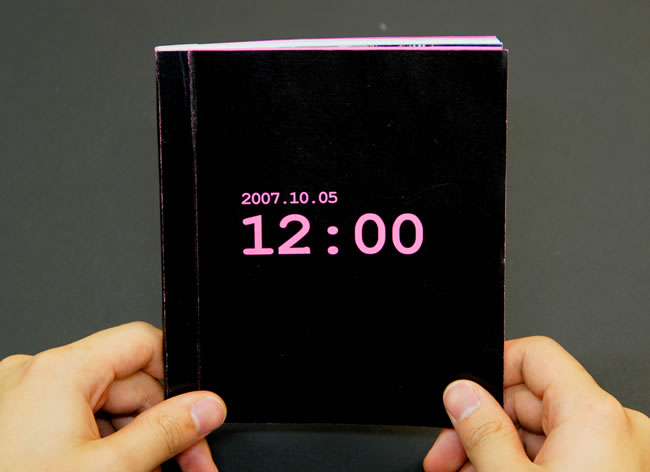
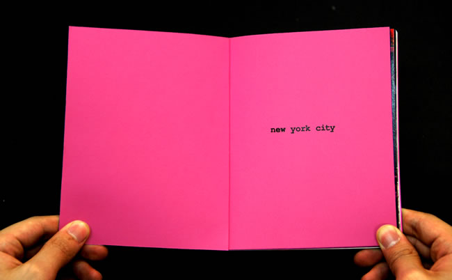
More often than not, we give very little attention to moments in time. But the truth is,
anything
could happen at any point in time, and sometimes, those momentary events might change
the very course of your life. This project was done to let us appreciate every single moment in
time. Stickers stating a specific time and date were pasted all over New York City, with a single
happening written on it, informing the onlooker about the history of that place at one point in
time. The concurrentness of time and events lets us realise how many things could happen in a
single second, and someone might be dying and being born at the exact same moment in time.
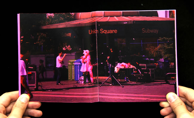
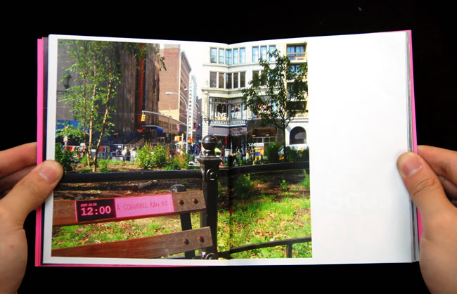
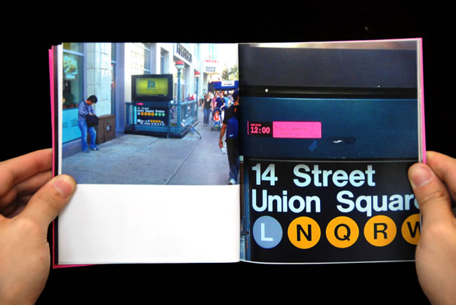
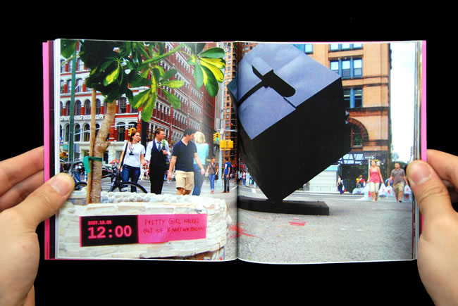
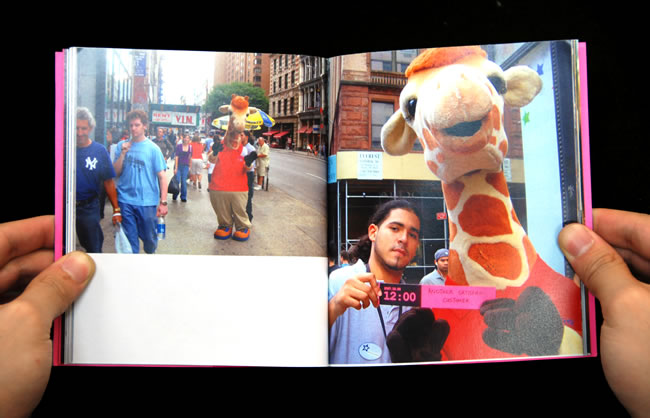
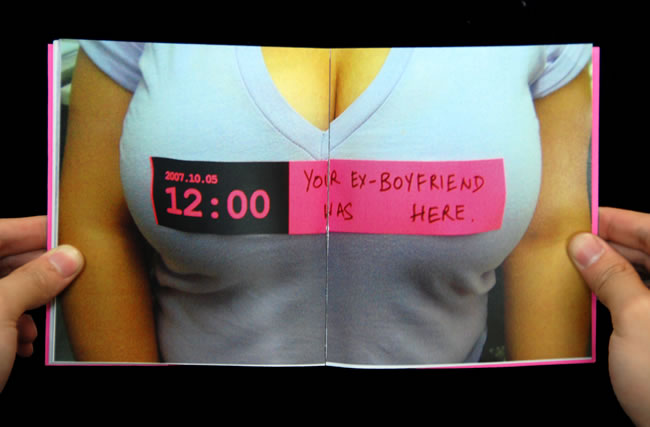
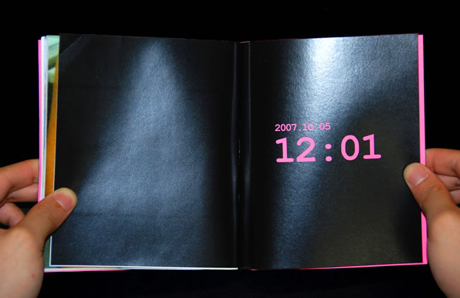
poster documentation.
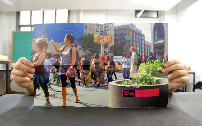
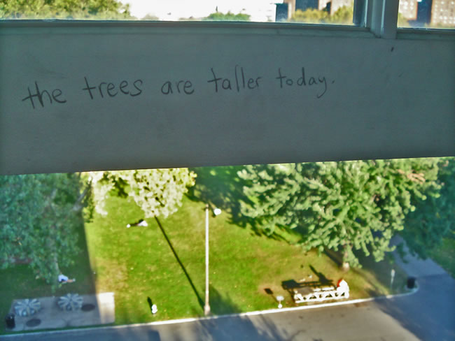
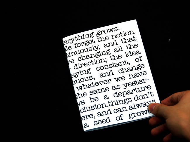
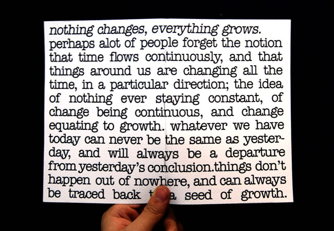
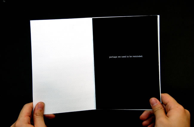
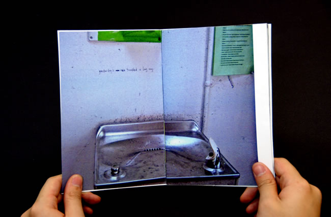
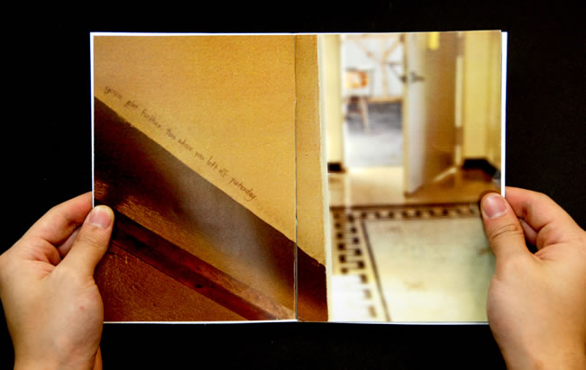
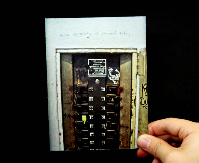
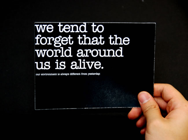
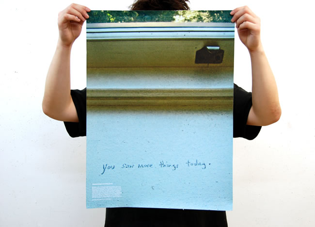
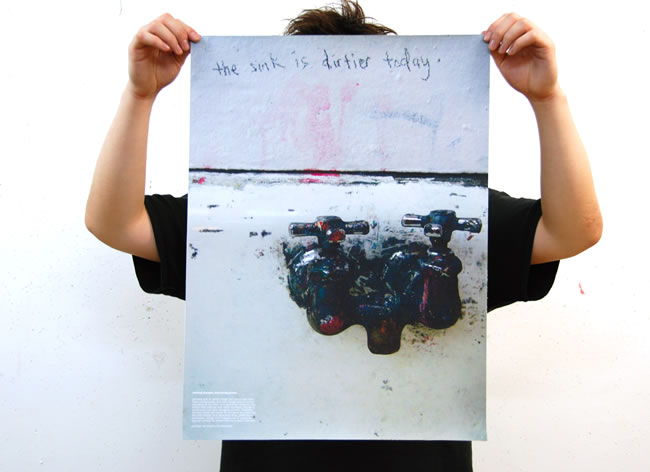
This project was conceived to remind us that everything starts from somewhere, and that things
are growing and evolving all the time. Time is always flowing continuously and nothing is ever
constant. Writings were done on walls to talk about a detail in that specific environment that
we might have forgotten or overlooked. The writings were then photographed and documented in
the form of a book, postcard and poster.
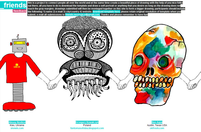
A drawing project conceived to connect people all over the world. A system of joining hands
was devised where participants could download and fill in with their own drawings. Submissions
were then collected and montaged on the website. This project began in October 2007 and is still
ongoing, amounting to over a hundred submissions to date from more than twenty different countries.
The project had been featured on various sites including www.startdrawing.org.
launch website.
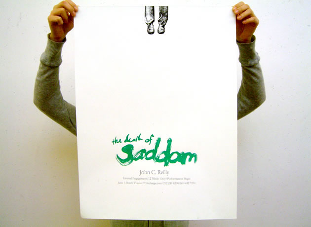
video ad for Death of Saddam.
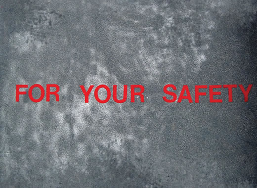
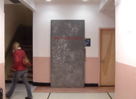
safety wall
A wall with the words “For Your Safety” was used as a blockade to various
entrances. The project was conceived to see people’s reactions to a barrier
set up by an unknown party and if they would accept the boundary readily
or cross it by all means.
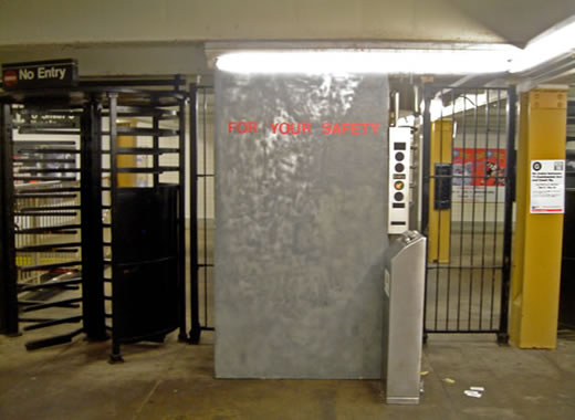
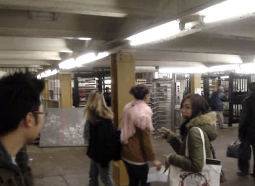
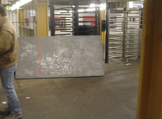
video documentation in the subway.
video documentation at the school elevator.
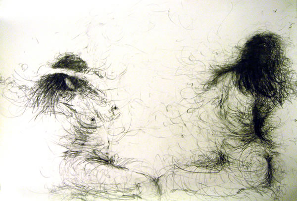
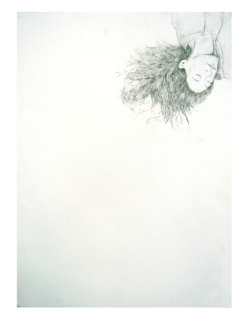
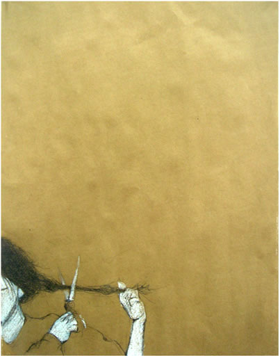
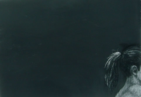
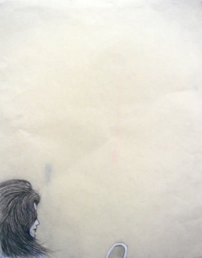
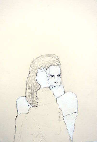
Hair
A series of drawings on paper on the vanity of women;
and the momentary loss of self when one cuts her own hair.
Info
Nelson is Chinese,
Born in Singapore,
Speaks British English,
And Lives in New York City
Making the World more
Beautiful Everyday.
Nelson shares his dreams and adventures here.
